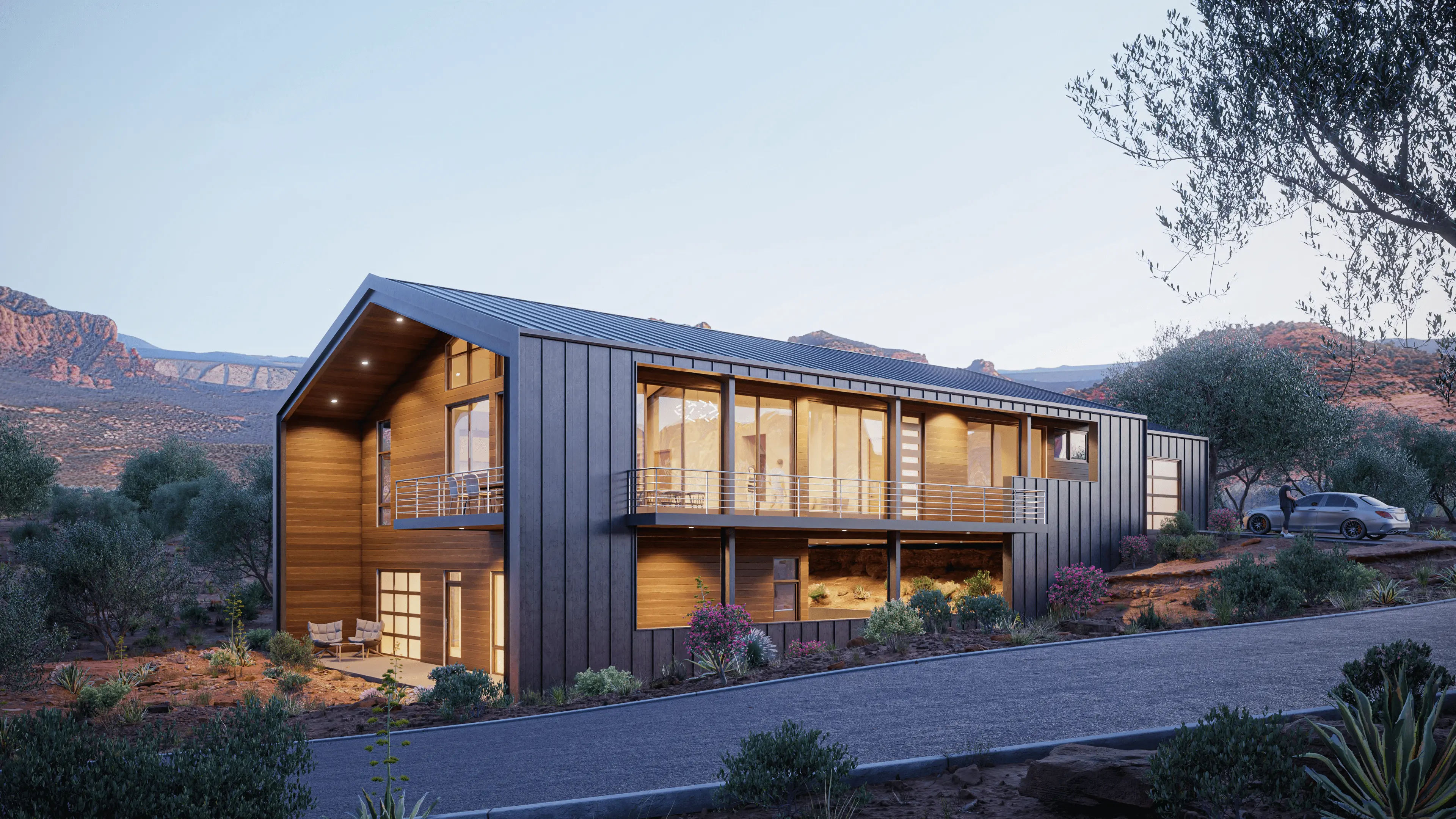
With Kontexture, we were on the same page from day 1 to launch. Our mission was to transform their dated website into a modern digital home that echoes their contemporary style.
Kontexture was established in 2013 by Daniel Istrate and Jorge Toscano. Kontexture is derived from the marriage of context and architecture which is what drives the design philosophy of the studio." To start, Kontexture's primary focus was residential architecture; however, as the firm scaled in size and experience, a diversity of commercial projects entered the fold. Now, Kontexture handles both residential and commercial architecture. Their work is sleek, sharp, and exudes modernity.
With this in the front of our minds, we had an exact idea of the style that we wanted to utilize for this website. We opted for a minimalist design that integrates many sharp edges and lines, On top of this, we chose to use Helvetica Neue for all of the text on the website, as it is both modern and timeless. For the headings, we selected for a bold font weight, while all body text was set to a light weight. To capture the futuristic air of Kontexture's style, we created a floating scroll tracker that we fixed to the right side of the screen. On top of this, we incorporated design elements and interactions that we have not used before. This includes a "reveal on hover" interaction for the projects contained within the Portfolio page of the site. Our final steps included designing custom animations tailored to creating a cutting-edge, innovative feel.
As always, the site was built using Webflow. This was the platform of choice as it offers premium security, scalability, and ease of management for clients (post-launch). It was truly a pleasure getting to collaborate with the team at Kontexture, as they are vivacious, kind-hearted, and talented, which makes for a great partnership.
I have to say that our website has been very successful!! We’ve been getting a lot of applications for jobs in and everyone we’ve spoken to, whether they’re consultants or clients, they mention how great and beautiful our website looks! It’s been a hit so far and I am sure it will continue to be. I just want to say how grateful I am that you were so patient and helpful with us! And thank you for designing such a beautiful website that we’re proud to show off! We did not know what we were missing in waiting so long to reach out to you.